Display,
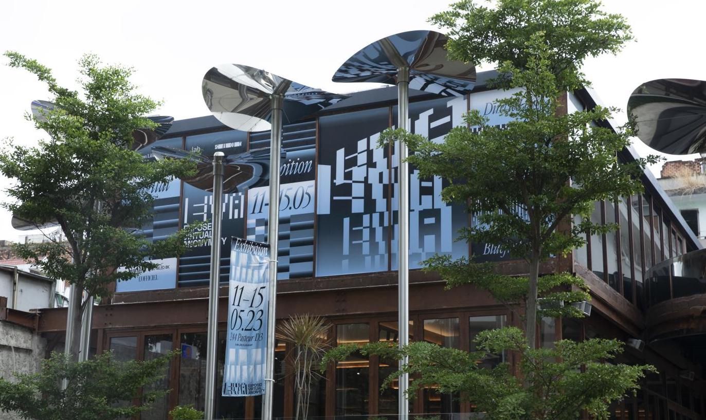
Tra Giang Nguyen (gydient), EVA - Exposed Virtual Anonymity exhibition in Ho Chi Minh City, Vietnam.
Developed from her BA thesis in 2023.
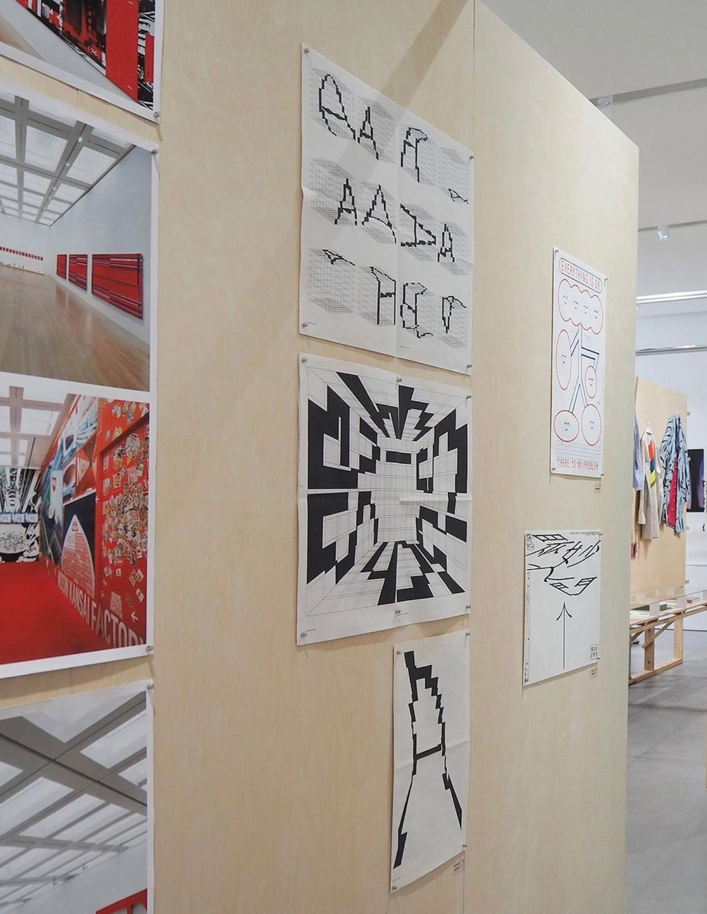
“The Alphabetical Room” on display in Hangzhou, China, as part of the @tokyotdc Selected Artworks 2022-2023 exhibition.
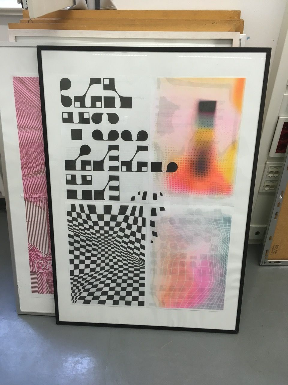
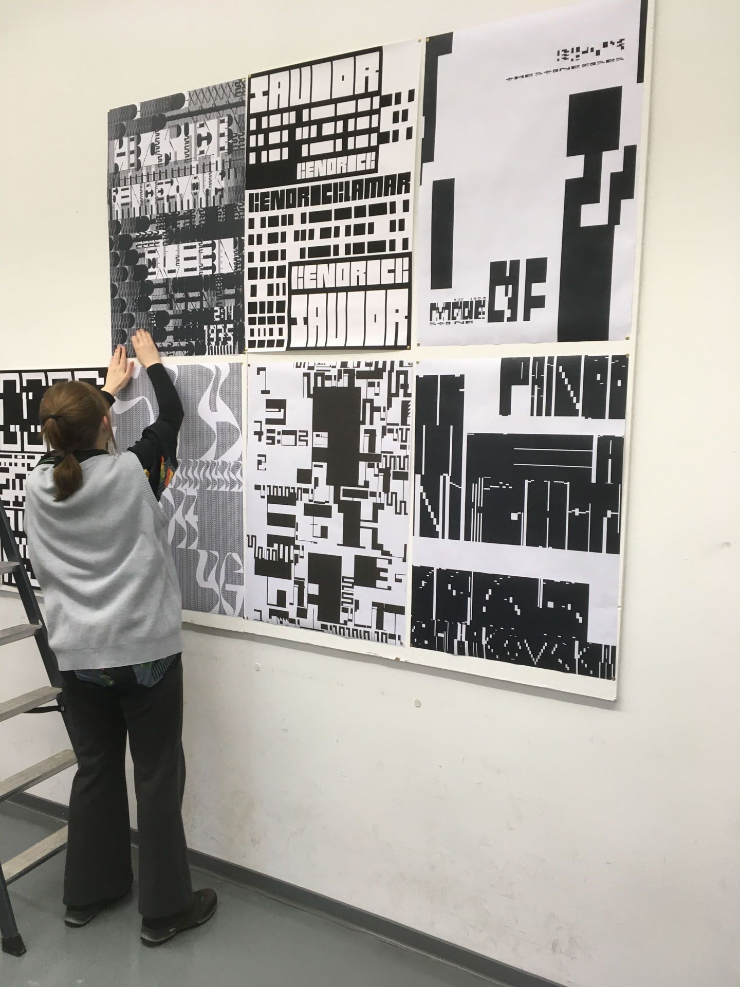
A1 multicolor riso printing and typedesign by Laura Haertl, winter term 2022.
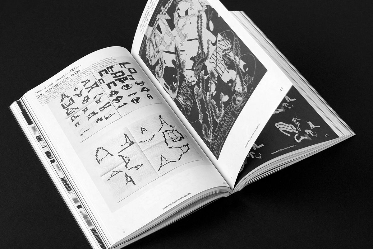
“The Alphabetical Room” published in Slanted Magazine #40, Experimental Type 2.0.
“Reading & Reacting”, a documentation of variable typefaces developed in the summer term 2023.
The variable typeface “Dialog” by Finn Reduhn, developed in the summer term 2023 as presented in “Reading & Reacting”.
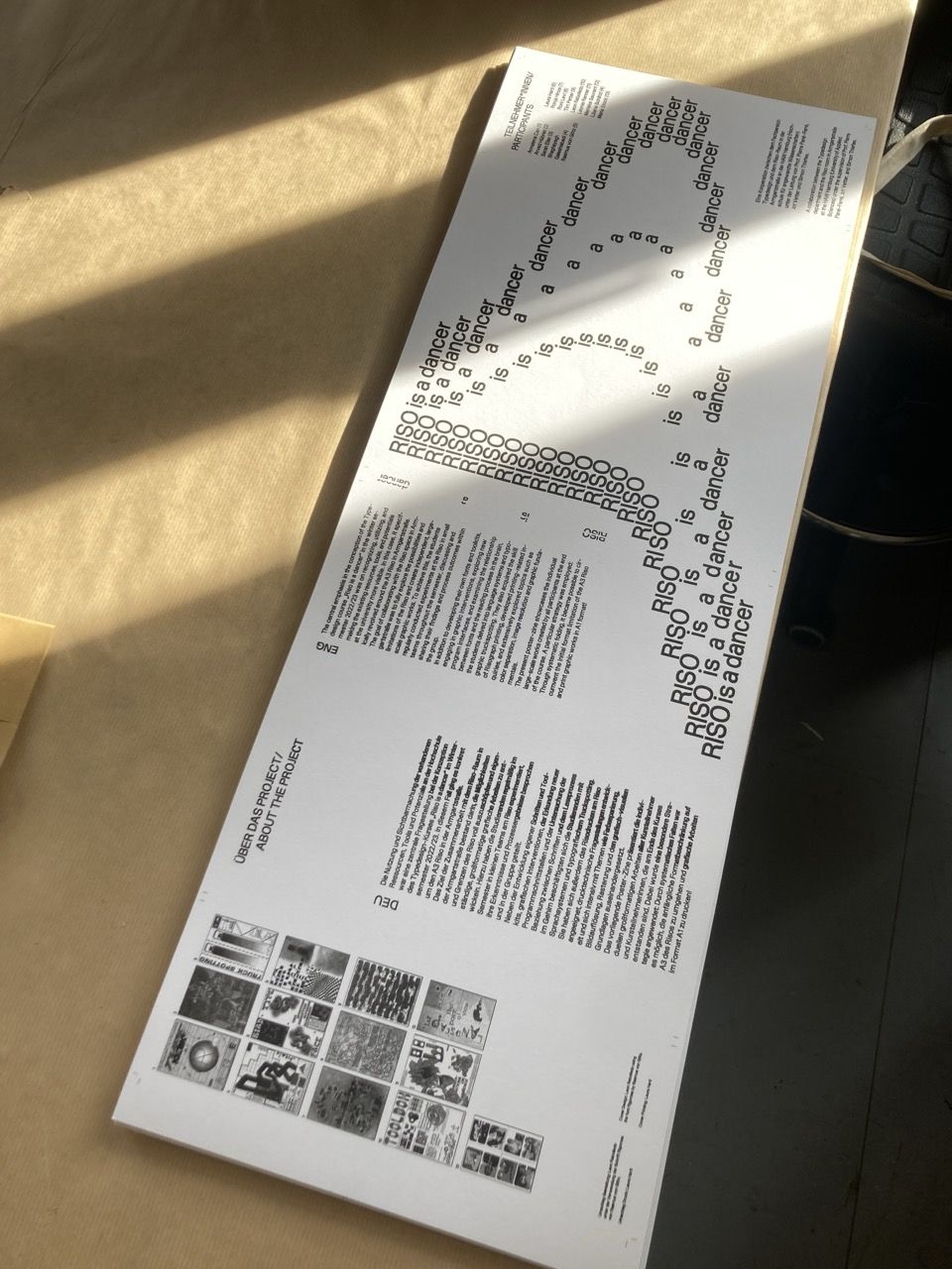
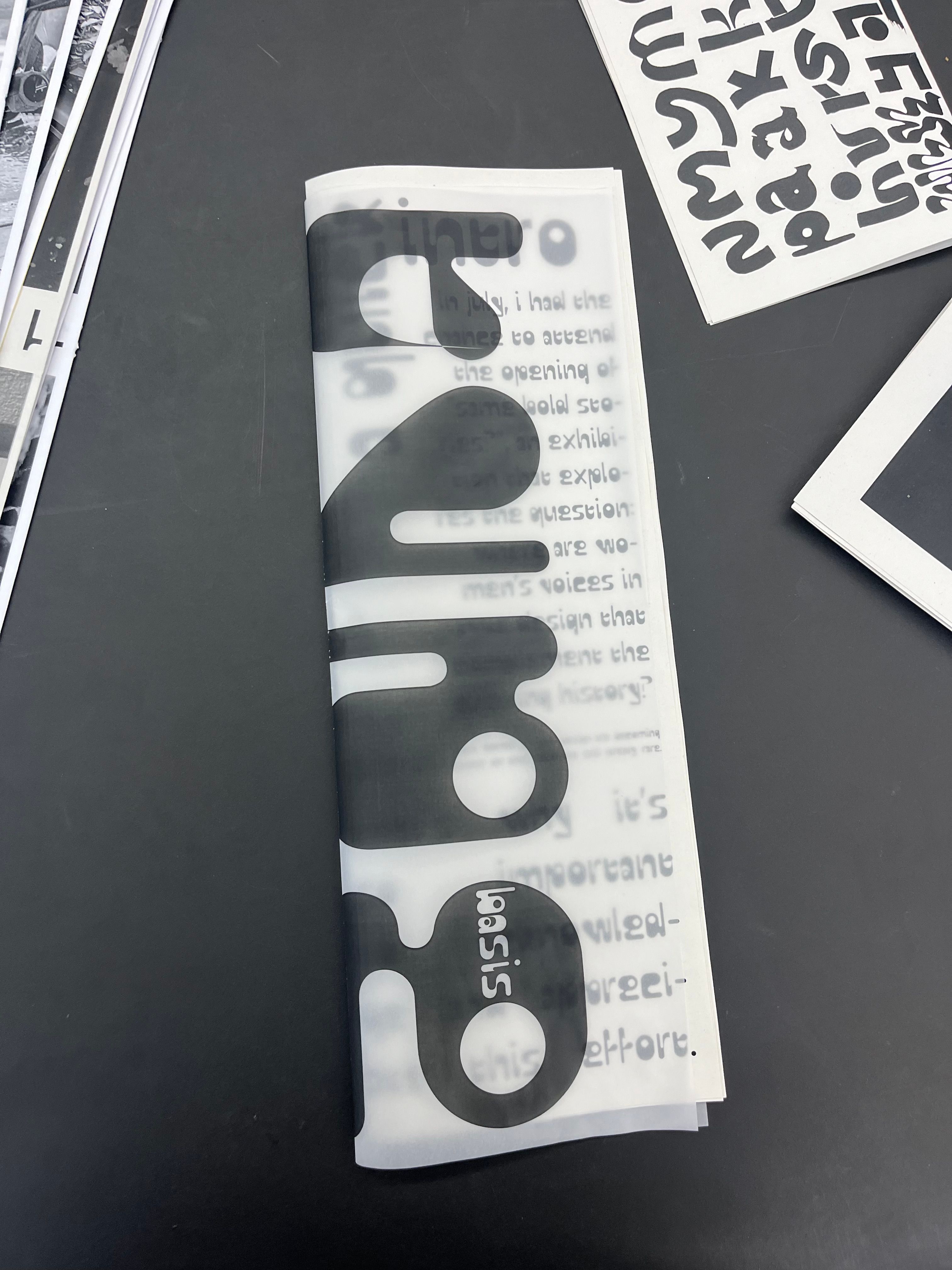
In use “Rigorosa Medium” by Rasmus von Goetz on the wrapper, designed by Leon Rebolledo, for the A1 riso-printed posterzine “Riso is a dancer”.
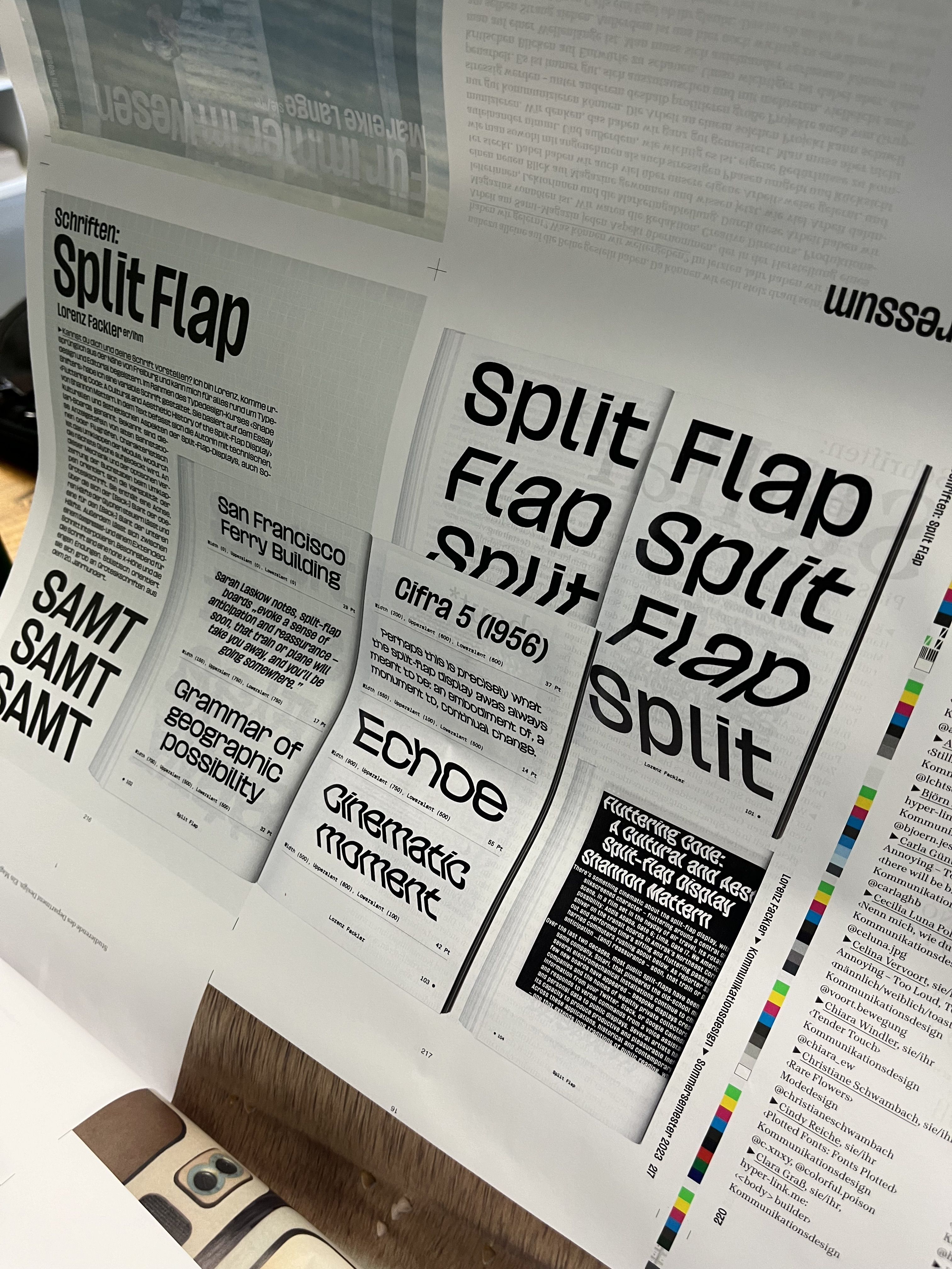
Lorenz Fackler, SplitFlap Variable (WIP), summer term 2023.
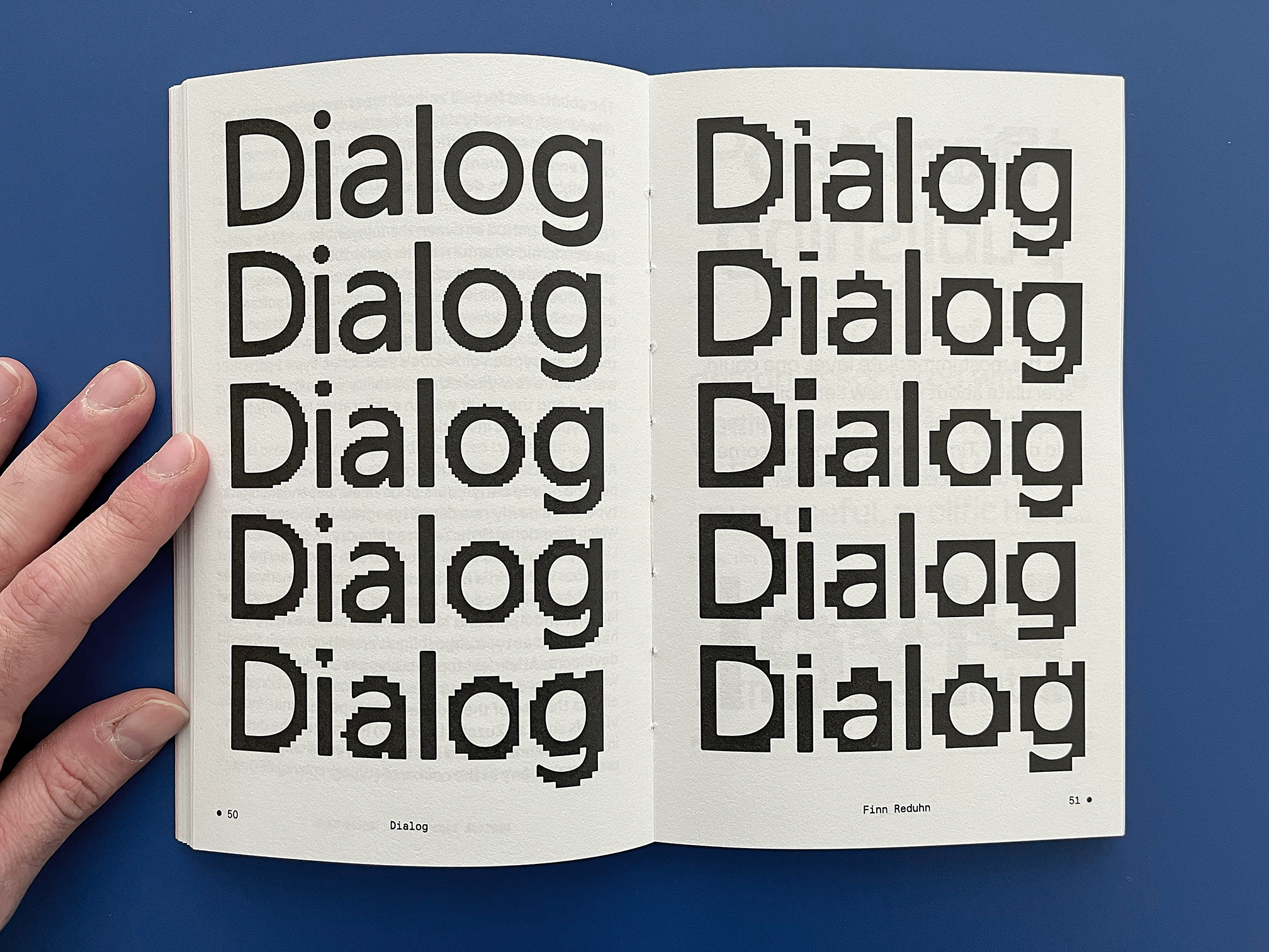
Grid
Pantograph,
A Case Study, For example R.,
With the increasing digitization of private and public archives in the last ten years, an incredible source of materials has become accessible. How do we deal with this abundance of sources? How do we approach the past? How can a classroom serve as a space for critical historical inquiries and discussions, particularly for graphic and type design students new to historical research and the discourse around the construction of historical narratives?
From mid-October to mid-December, we collectively examined surviving posters of R, one of numerous poster printers active between c.1845 to1867 in Paris, a period often excluded in today’s design curriculum. In contrast to his contemporaries, R’s approach was distinctive. Not only were the dimensions of his posters, often exceeding two meters, uncommon, but also the amalgamation of various techniques and the extensive use of multiple colors stand out from today’s perspective. This was possible as R drew upon knowledge derived from printing techniques previously reserved for the manual production of luxurious multicolored wall papers around the turn of the 18th-century. These techniques involved the manual application of color through brushes, stencils or printing forms (clichés) and the reproduction of colored illustrations in various sizes facilitated by the capabilities of the pantograph, a tool to proportionally enlarge or reduce templates.
48pp
35x50 cm
-- €
Order
The Alphabetical Room
Drawing inspiration from Josef-Müller Brockmann’s 1961 grid concept for architectural spaces, the publication “The Alphabetical Room” presents Liad Shadmi’s typographic exploration into the boundaries and limits of writing within a strictly calculated mathematical three-dimensional grid.
Throughout the publication, Liad Shadmi systematically investigates these grids, examining the viewer’s changing perspective along with the changing resolution of these hypothetical letterforms. Accompanying the publication is a brief introductory essay by Liad, shedding light on the enduring fascination of graphic designers, programmers, creative coders, and visual artists with this subject. The work was created within the type design course “Letter shapes are entirely described by numbers” in 2022 and was awarded as TDC Tokyo Prize Nominee in Japan, received a Certificate of Typographic Excellence at the New York Type Directors Club 69 and was featured on It’s Nice That.
20pp newsprint
35x50 cm
15€
Order
Octagon Variable, Type Specimen
Printed on 45gsm salmon-colored newsprint, this specimen celebrates the open-source launch of “Octagon Variable”, an educational type design project.
Based on Octagon – a wood type first shown in George Nesbitt’s First Premium Wood Types Cut by Machinery in 1838 – “Octagon Variable” is a reimagination of the original design by Edwin Allen. Today, the original Octagon wood blocks of a full uppercase set in 8-line (no figures or lowercase seem to have existed) are part of the Rob Roy Kelly collection in Austin, Texas. As part of a first year type design introduction class, we re-drew and re-imagined the design and pushed the already present spatial illusions further collaboratively. The specimen is completed by a short text that traces the origin of the typeface.
“Octagon Variable” was designed by Alexander Royter, Emma Schmalisch, Felix Willnauer, Friederike Temme, Greta Wachholz, Jason Tsiakas, Julia Baskal, Julia Schmidt, Kaja Wetzel, Kateryna Shelevytska, Lara Tamminga, Nina Vierke Liyani, Sania Salem, Sarah-Ann Roehlen, Sofiya Slyusarenko, Stina Scholz, Vanessa Schneider, Zoe Rygus with contributions by Pierre Pane-Farre and Simon Thiefes. “Octagon Variable” is made available under the Open Font License and can be downloaded as static as well as variable font file over here. More information can be found on the git hub repository.
16pp newsprint
29x38 cm
8€
Order
Reading and Reacting
160pp digital
12x19 cm
--€
Order
Shape Shifters Type Specimen
What texts should be included in a type design reader?
16pp newsprint
29x38 cm
12€
Order
Info
“display---pantograph.xyz” is a platform that is two-fold: On the one side it’s “Display” allows a glimpse into the ongoing timeline of the type design classes at the Hochschule für Angewandte Wissenschaften in Hamburg. Simultaneously, it is the digital home of “Pantograph”, a non-profit micro-label, closely aligned with these type design classes, which aims to publish projects stemming from typographic research and conceptual approaches within type design.

The variable typeface in use is “Dialog” (WIP) by Finn Reduhn and stems from his close-reading and reacting towards the texts “Digital type decade” by Emily King and “The digital wave” by Robin Kinross. This platform and “Pantograph” are projects initiated by Prof. Pierre Pane-Farre. The website was developed together with Simon Thiefes. Please don’t hesitate to reach out via email, if you have any questions or would like to connect!